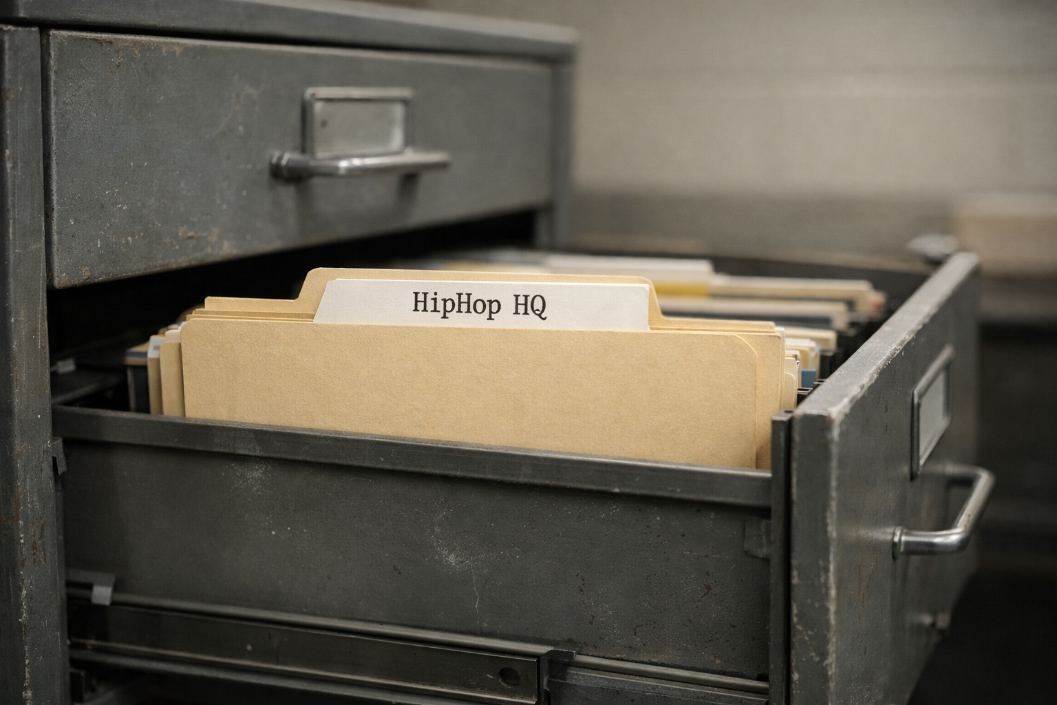
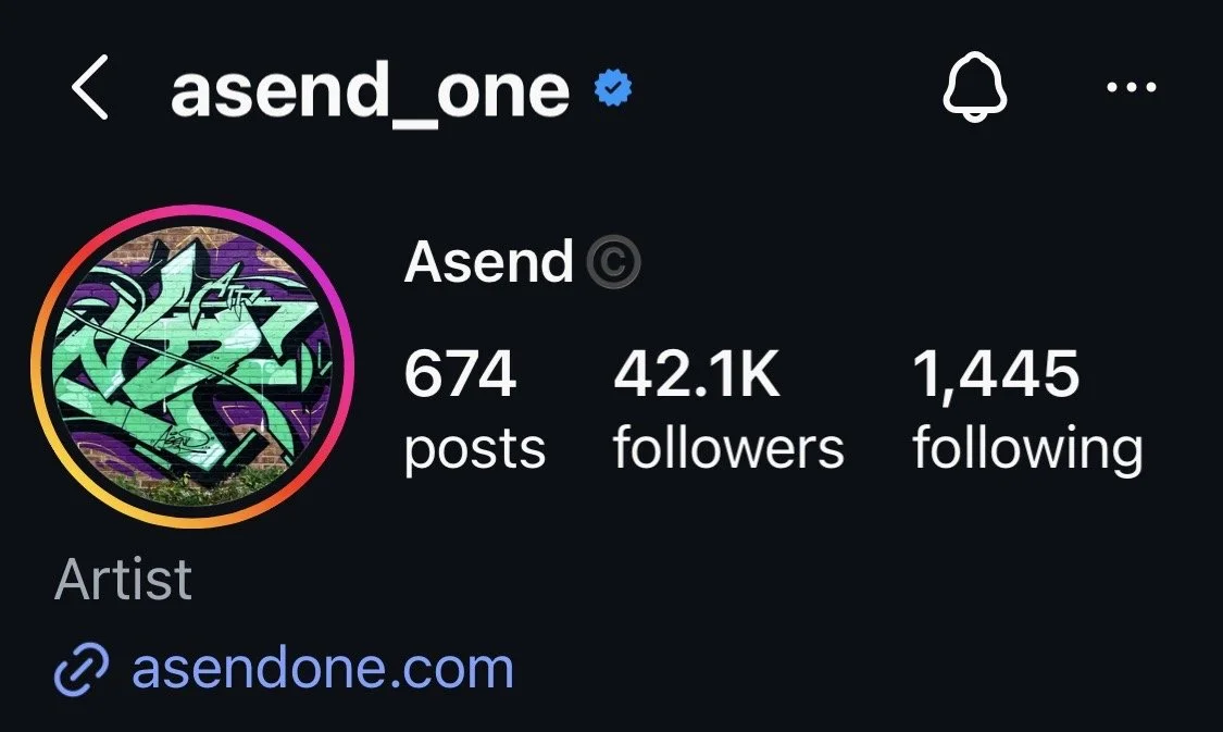
Graff Writers
Before HipHop had a stage, it had a surface. Graffiti writers turned the city into a canvas and made sure the Kulture couldn’t be ignored. Trains, walls, tunnels, rooftops, if it could be reached, it could be written on. This section exists to honor that original act of visibility and the discipline behind it.
Graffiti isn’t decoration. It’s declaration. A name written once is nothing. A name written everywhere becomes presence. That’s the game. Repetition, placement, style, all working together to make sure you’re seen whether people understand it or not. You don’t wait for permission in graffiti art. You take space, and how you take it matters.
This is where style becomes identity. Letter structure, line weight, color choices, flow, all of it separates one writer from another. Two people can write the same word and it’ll look completely different. That difference is where reputation is built. This section is built around that individuality.
Graff writers don’t just write names, they develop signatures. Tags, throw-ups, pieces, each level carries its own intention and complexity. A tag is speed and presence. A throw-up is impact. A piece is time, precision, and control. Together, they tell the full story of a writer’s range, and the environment shapes everything.
Graffiti was born in motion. Subway systems, city blocks, places where work would travel and be seen by thousands. That changed how writers thought. You had to be fast. You had to be efficient. You had to know your surroundings. The city wasn’t just a backdrop, it was part of the process. That pressure builds discipline.
There’s risk involved, always has been. Timing, awareness, knowing when to move and when to stay still. That tension forces focus. It sharpens decision-making. It turns every action into something intentional. But beyond the risk, there’s communication.
Writers speak to each other through walls. Styles evolve in response to what’s already out there. One piece influences the next. Crews form, reputations spread, respect gets earned over time. It’s a conversation that doesn’t need translation, and the impact reaches further than most realize.
Graffiti shaped the visual language of HipHop. Album covers, logos, branding, design, all of it carries that influence. What started as names on trains became a global aesthetic. This section exists to document, study, and push that forward. From foundational lettering to advanced styles, from the history of the streets to the evolution of modern graff, this is where the visual voice of HipHop is explored.


BLADE
Blade is the kind of writer whose name carried weight long before documentaries or coffee-table books ever tried to tell the story. He wasn’t chasing stardom, he was chasing domination and for a good stretch of the ’70s and early ’80s, he had it. Blade made sure the whole city learned how loud that language could get. His whole approach was aggressive, ambitious and fearless, exactly the temperament HipHop was born from.
Where most writers were filling space, Blade was taking territory. He wasn’t hitting a train here and there, he was taking over entire lines, turning subway cars into rolling declarations of presence. His whole cars weren’t just murals, they were statements. I’m here. I exist. You’re gonna see me whether you want to or not. Carving out oxygen in a world that acts like you don’t deserve any.
What made Blade special wasn’t just volume. It was vision. His pieces were big, bold and wild without losing clarity. His letters had muscle. His colors popped. His imagination was always extra. 3D illusions, characters, shapes that didn’t care about the rules.
Blade represented expansion. He showed that graffiti wasn’t just tagging, wasn’t just bombing, wasn’t just a neighborhood thing. It was a citywide art form, a battlefield and a movement that deserved ambition. He carried that mentality into the Kulture at a time when HipHop didn’t have museums, didn’t have corporate sponsors, didn’t have safety nets. It was pure survival paired with raw creativity.
In the story of HipHop’s visual identity, Blade is the example of what happens when courage and craft meet opportunity. He made the trains impossible to ignore and by doing that, he made the Kulture impossible to ignore.
FUTURA
Futura is the moment graffiti stopped being just letters on steel and started becoming pure futurism, movement, abstraction and intention. Before him, most writers were focused on style, burners, characters, outlines, pieces. All valid, all iconic. But Futura walked into the game and quietly said, Watch this, I’m gonna paint the future.
Coming out of the ’70s train era, Futura (then Futura 2000) took the same canvas every writer used, NY subway cars and flipped the entire language of graffiti. Instead of heavy outlines and comic-book characters, he brought cosmic gradients, motion, abstraction, orbiting lines, floating shapes and that unmistakable sense of weightless rhythm. His pieces looked like if HipHop and sci-fi had a child.
He wasn’t following rules. He was rewriting them. Futura proved graffiti didn’t have to stay inside the grammar of letters. It could be fine art, it could be design, it could be mood, it could be a whole new way of visualizing sound, movement and space. HipHop is innovation and Futura is one of the purest symbols of that instinct.
When the Kulture exploded globally in the early ’80s, Futura traveled with it. Instead of shrinking when graffiti got commercialized or institutionalized, he expanded. He painted live on stage with The Clash. He stepped into galleries without losing his edge. He brought aerosol into the world of graphic design and fashion decades before it was cool.
Nike. UNIQLO. Supreme. Mo’ Wax. Every collab carried that same quiet, sharp, interstellar energy that only Futura can deliver. He became the bridge between graffiti, streetwear, music and fine art. Not because he chased those lanes, but because those lanes realized they needed him.
Futura expanded HipHop’s imagination. He turned the spray can into a precision instrument. He made graffiti feel like jazz, improvisational, alive and unpredictable. He helped the world understand that HipHop’s visual language doesn’t end at the edges of a letter, it stretches as far as the galaxy you’re brave enough to paint.
KASE 2
Kase 2 wasn’t just a writer, he was a stylist, an inventor and a walking reminder that HipHop grows strongest in the places nobody expects.
In a world full of writers trying to perfect what already existed, Kase 2 flipped the whole script. Kase didn’t just push style forward, he shattered the idea that style even had limits. His letters weren’t traditional, weren’t symmetrical, weren’t safe, they were wild shapes, broken angles, geometric distortions and digital chaos long before anyone was talking about computers, pixels, or vector graphics. Writers all over the city saw those pieces and had to ask themselves, Yo, am I even trying hardenough?
He called himself the King of Style and honestly, he earned it. His work wasn’t clean or polite, it was futuristic, mechanical, broken-up, rebuilt and alive. The man invented computer rock style, a letter form that looked like it came out of a machine in a decade we havn’t reached yet.
Then there’s the part of his story that makes his impact even heavier. He did all that with one arm. In a Kulture built on confidence, resilience and refusing to let circumstance define you, Kase 2 is one of the purest embodiments of HipHop’s spirit. He didn’t hide it. He didn’t ask for sympathy. He turned it into part of his identity, part of his legend. When people saw his work and then saw him, the message landed even louder. No excuses. No limitations. Go paint something impossible.
When you look at what Kase brought to graffiti, you see the same ingredients that drive the entire Kulture. Innovation, pushing past what everyone else accepts as normal. Rebellion, breaking rules just to prove rules can be broken. Individualism, developing a voice so distinct nobody can imitate it. Heart, showing up, creating and dominating regardless of obstacles.
Writers like Kase 2 are the reason graffiti evolved from simple signatures to full-blown visual architecture. He helped turn writing into design, design into expression and expression into language. Nobody was doing letters like his before he showed up and even now, his style DNA can be found scattered through modern graffiti, street art, graphic design and album aesthetics.
PHASE 2
Phase 2 is one of those names the Kulture whispers with respect, not just because he was early, but because he was defining. He wasn’t out here chasing fame, he was shaping the visual DNA of HipHop before most of the world even knew what they were looking at.
In the early ’70s, when the whole movement was still nameless sparks coming out of the Bronx, Phase 2 stepped up with a style so clean, it forced everybody else to level up. His letters didn’t just sit on the wall, they danced, curved, expanded, carried personality. Where most people wrote their name, Phase designed one.
He’s the architect behind the bubble letter style, but saying it like that almost undersells him. Those letters became the universal language of HipHop, the first alphabet of a Kulture that didn’t have textbooks yet. Kids from every borough, every city that came after, they learned to write through the shapes he invented. Across the US, Europe, Asia, they studied his outlines without ever meeting him. That’s legacy.
Phase 2 wasn’t just tagging, he was showing HipHop how to push imagination past whatever the environment gave you. He treated a wall or a train car like a blank dimension. An empty universe waiting for color, attitude and innovation. His work had this energy that said, we can build our own world. We don’t need permission. That’s the same spirit that lives in every eMCee who forges their own lane, every DeeJay who flips a break into something new, every producer who bends sound into shape.
He didn’t stop at writing. Phase 2 took that artistic instinct into flyers, logos, event posters, design work that helped define the look of early HipHop Kulture before media companies tried to package it. He was one of the first to take the graffiti aesthetic off the trains and bring it into the wider Kulture, showing that this wasn’t vandalism, it was art, craft and identity.
Phase 2 gave the Kulture a visual backbone. He gave writers permission to innovate. He gave the world a style no one had seen before and he did it at a time when the only people who believed in HipHop were the ones building it day by day. When you talk about pioneers, architects, foundation-layers, you can’t build the gallery without Phase 2 on the first wall.
SEEN
Seen isn’t just a graffiti writer, he’s the closest thing graffiti has to a global brand. When people outside the Kulture think about subway art, wildstyle burners, or the raw visual identity of early HipHop, they’re picturing something that looks suspiciously like a Seen piece. That’s how deep his fingerprints run.
Coming out of the Bronx in the late ’70s, Seen treated the subway system like a personal gallery. A citywide, moving, steel-and-grime museum that hit every borough, every platform, every commuter’s line of sight. His pieces weren’t small tags tucked into corners, they were whole-car explosions of color, shape, character work and style. By the early ’80s, Seen was so dominant on the 6 line that writers literally waited for his trains to roll by just to study them.
What made Seen matter isn’t just volume, it’s vision. He understood the subway as a broadcast system. He understood style as identity. He understood that graffiti wasn’t vandalism, it was art direction for the entire city.
Seen didn’t just do letters, he brought in full characters, comic-book energy, technical sharpness and a sense of scale that made everything feel cinematic. Before the world ever called it street art, Seen was already painting graffiti with the confidence and composition of a world-class muralist. That instinct, that push, helped lift graffiti from underground rebellion to respected visual Kulture.
Then came the global influence. Movies like Style Wars, books like Subway Art, exhibitions overseas, Seen’s work became the international ambassador for the entire movement. Kids in France, Germany, Japan, Brazil, they weren’t just copying graffiti. They were copying Seen. His outlines, his colors, his characters. He became the blueprint for what a polished, powerful graffiti piece should look like.
That ripple effect is why Seen is crucial to HipHop. He helped carry the Kulture to the world. He showed the international scene what New York style looked like at its highest level. He proved that graffiti could be both rebellious and masterful at the same time.
Seen expanded the imagination of the Kulture. He made trains legendary. He made graffiti global. He showed every young writer picking up a can for the first time that their art could reach far beyond their block, all the way to the other side of the world.